Showing posts with label how to. Show all posts

Wednesday, April 17, 2013

So you want to dress like...
Carey Mulligan as Daisy Buchanan on Vogue

As May 10th looms nearer, Art Deco dreams are taking over my headspace.  I have many ideas for the upcoming surge of inevitably Twenties inspired looks sure to circulate on the web with the release of The Great Gatsby.

This week, Vogue hit newsstands with Carey Mulligan on the cover - giving those in the fashion world a taste of the costumed opulence to come.

How can the every day fashionista be her own Daisy Buchanan?  Well, Tiffany and Co. has decided to release a Gatsby inspired jewelry line.  I suppose that's one method.  What about the girl who's watching her wallet?  Today's post gives you a spring look that echoes Mulligan's elegant outfit.


 photo cmvogue_zps423d8942.jpeg


Stay tuned for more Gatsby themed looks in the coming weeks...

Until next time!

~ they seek her there

Thursday, February 7, 2013

In Honor of October 19th...
How to Dress Like Annie Edison

Today is the season four premiere of our cult favorite Community.  In honor of the show returning, I decided to style myself a la Annie Edison.  (And, yes, the Hello Kitty binder is really mine...)


 photo SAM_0123b_zps394471c9.jpg

 photo annieedison_zps1de4c2d0.jpg


My outfit:  Tee: (Gift) Old Navy // Sweater: ($15) Forever 21 // Skirt: ($10) Wet Seal // Tights: ($5) Target // Boots: ($80 $20) JCPenney // Bracelets: ($4) Forever 21 // Earrings ($3 for set): H&M // Necklace (Gift)

Inspiration set:  Sweater;  Necklace;  Earrings;  Bracelets;  Binder;  Boots;  Top;  Tights;  Skirt


Happy October 19th!  Enjoy. 

~ they seek her there

Wednesday, September 5, 2012

Unconventional Styling - What to do with those pesky vacation tees?

Now that Summer is in its twilight, re-organization of our lives and our closets are in order. Recently, I've been weeding out all the pesky pieces of rarely worn clothing in my collection. One of the methods I try to employ to keep the size of my wardrobe small and to also maximize its usefulness is to often restyle. What is restyling? It's the habit of taking a piece of clothing in your wardrobe and styling as many outfits as possible around it. This practice is especially helpful for those who have limited space but want a change in their wardrobe from season to season.

In the recent downsizing of my own apparel, I realized the alarming amount of tees that I have accumulated over the years. Among these tees, I found that I had in my possession a few of those dreaded "My friend went to _____, and all I got was this lousy t-shirt" tops. I know I'm not the only one who has these lying around the house, and I wanted to give you guys some ideas of what you could do with these all year round.


On the Lakeshore
Photobucket


The first choice in my set is a testament to city that is very near and dear to me - Chicago. Strange Cargo, the company who designed this tee, is a homegrown company. Their Lake Michigan tee is a fresh take on the classic vacation t-shirt. I put together this set with a last ditch celebration of Summer in mind. It is also styled with a vintage twist in mind - of days long past when we traded friendship bracelets and the worst thing we had to worry about was remembering the sunscreen while laying out.


Fall Transition

Photobucket

This is a clear transitional outfit to take you from Summer to Fall. Popping colors make this outfit eye-catching. The fun colors are (not surprisingly) inspired by the New Orleans atmosphere. This set is also extremely functional - a feature that I often appreciate in an outfit.


The Travelin' Man


Photobucket


One of the most important aspects of traveling is being comfortable. Whether your preferred method of transportation is car, train, or plane, casual clothing is a must! It's also important to bring functional clothes while you're out wandering. When I travel, I like to remember to bring a jacket or sweater that can be incorporated into all of the outfits I've packed. Shoes that can go the distance and a versatile backpack are also important to the regular traveler. This Cleveland tee was the inspiration for the men's set. The colors are toned down enough to make the transition for Fall. I've also incorporated a pair of pants that are on trend with the current colored jeans fad.


I hope I was able to give you guys some insight on multipurposing otherwise non-functional pieces to keep your wardrobe small while having limitless outfit possibilities. Feel free to share your own examples of outfit re-purposing with me here or on Facebook.


Until next time!

~ they seek her there


Friday, June 29, 2012

Unconventional Styling - Fireworks and Soireés

If you're a regular reader of fashion blogs, magazines, or watch T.V. shows that have anything to do with modern living, you've probably seen those featurettes about "What to Wear for the Fourth" (or something along those lines). Yes, these tips can prove to be helpful, but more often than not I find that some of the suggested styling is a bit...overdone. These outfits are a bit more "patriotic" and less functional than most people would like their wardrobe to be. This is where I'd like to offer a helping hand to some of you wondering just what to wear to those BBQs and celebrations for Independence Day.

For the ladies...

Photobucket


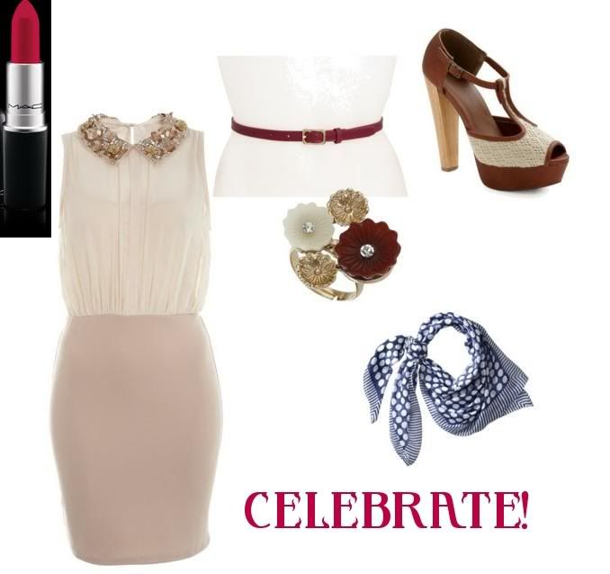
I haven't completely rejected the red, white, and blue color theme of the Fourth of July, but I've certainly toned down the intensity of the colors. To me, this outfit can be worn anytime during the Summer season. I've ensured that the look has a vintage flair with the scarf, shoes, and cut of the dress. I've also made sure to suggest some amazing red lipstick that will make you stand out. It's the little things that count!


For the guys...

Photobucket


Again, this is an outfit I think a guy could wear anytime during the Summer months. To me, the colors are even less obvious for the Fourth than the pieces in the women's set. This is okay, though, since we're still remaining in the red and blue color families. I added the pocket knife as both a seasonal and practical touch. There's always use for a multipurpose tool at a backyard BBQ!


Here's a bit of a breakdown with tips on how to style your own outfit for the Fourth:

  • Pick related (but not obvious) colors

    With the women's set, I did this by picking out pieces of a darker red and minimizing the amount of blue that I used in the look. With the men's set, I stuck to the same color families but went outside the usual boundaries of a traditional "blue" or"red". For both outfits, I chose to accent with vintage looking pieces that carried neutral hues. Again, this tones down the color of the main look.

  • Decide on pieces that can be worn after the holiday

    You want to get as much wear as you can out of your clothes. This is my personal philosophy, and I try to stick by it as best as I can. Buy a timeless (and maybe even seasonless) piece. The dress in the women's set is a great example of this. DO NOT buy pieces that have holiday-specific prints! This really limits you and can sometimes look cheesy!

  • Stick to your personal style

    It's always important to never deviate from what you're comfortable doing with your own styling. Yes, I've given a bit of a vintage flair to the women's set, but if that's not your thing it's okay! Do what feels natural to you, and you'll look AMAZING.


As always, feel free to throw your two cents in on what you'll be wearing for your Fourth of July celebration!

Next week I'll be coming to you from Minneapolis! Get ready to see some of the city in my posts.

Until next time!

~ they seek her there

Wednesday, May 23, 2012

Unconventional Styling - Neon

Much like last Spring and early Summer, neon is a trend that is not disappearing anytime soon. When trends don't seem to want to die out, it's better to embrace them than to fight them. Neon is loud and fun and (mostly) painless to pull off. Unfortunately, neon is also extremely unconventional. It's not always going to be on trend so it requires a bit of imagination to fit into your wardrobe. This is where my blog post today comes in...

This really started sometime last week. One of my co-workers was looking for a pair of shoes to wear with a dress she had ordered for a wedding. (See Set #1.) My (admittedly strange) first instinct was to go with a pair of neon pumps. She liked the idea, but apparently the people attending the wedding were more "conservative" with their dressing and she didn't think she would quite fit in. We moved on. In the end, we found a pair of shoes that would combine her "brighter" preferences and also allow her to blend in with the other attendees.

After the dilemma was solved, I couldn't quite get my immediate response out of my head. Yes, putting neons and neutrals together was a basic fashion step for the season but since when is this my go-to tip for styling? When did such unconventional looks become the norm for me? This warranted some thinking about.

What if you weren't afraid of trying those strange, not conservative looks out on the street, in your classes, to the beach, or to run errands? Even I hold back a bit myself sometimes. Below are three looks that "push the envelope" in styling. Two are simple matches that you can follow on example and do yourself. The third is a more complete look to challenge you...


Set #1

Photobucket


This is the look I had suggested to my co-worker. This is the exact dress she had ordered and the heels I suggested she pair the dress with. This also marks the first time that a plus-sized piece has been used in any of my sets. There will be lots more featured in the future!


Set #2


Photobucket


This is a great "bridge the gap" between Spring and Summer outfit. For those slightly chilly mornings or nights you have this fun poncho. Pair with neon shorts to give you a unique look and "bright" attitude.


Set #3


Photobucket


Here's our challenge for the post. I'll confess that I based the entire look around the tights. Tights are one of my shameless addictions. (Someday you may even get a post on them...) For such a loud piece, you need a simple neutral to tie it together. This is the purpose of the black dress. We've got neon pink nail polish and the purple heels to bring different color elements in from the tights. It's definitely a bit overboard - but in all the right ways!


Need styling advice - conventional or unconventional? Have you tried an unusual look that heads in admiration? Feel free to drop me a comment or Facebook message!

Until next time!

~ they seek her there


Monday, January 16, 2012

Our friend, the Color Wheel - Part 2

About a month ago, I addressed how to dress in complimentary colors in my first color wheel post. If you missed that post, I encourage you to click here and read that article first! For those of you who have already read the first post, your very long wait is over. Welcome to part two!

We'll start off (as usual) with the example outfit...


Photobucket

Shirt - JCPenney ($14.99)
Scarf - Old Navy (Gift)
Belt - Ebay ($8.00)
Skirt - Wet Seal ($5.00)
Tights - Forever 21 ($4.00)
Shoes - Forever 21 ($15.00)

As you might guess, the skirt is the focal point of the colors in this look. My shirt, scarf, and tights are some of the colors in the skirt that stood out to me upon first glance. Take a look at the pattern and see what colors jump out to you.


Photobucket

As you can see, there are many to choose from; so many that it's hard to pick just a few. I could have done sky blue, cobalt, mint green, pale yellow, light brown, even a near olive shade! The fact that I picked a vibrant red, purple, and mustard yellow to take from this skirt is just a testament to how much I adore bright colors and the fact that this was the last rare 50 degree day in Chicago (at least for a few months)! It's up to you, your personality, and the season that you wear this pattern in which will determine the colors you choose to highlight. This brings me to the next bullet point on the list.

4) Seasons determine the colors that you sport.

Point number two (Pick whatever accent color speaks to you) also goes hand in hand with your surroundings. Yes, it's January in Chicago, but up until a few days ago, we were experiencing Spring-like weather. In my opinion, this skirt transcends the seasonal color suggestion. That may not be the truth for some of you out there. Fashion commonly dictates that certain color options accompany the change of the seasons. Usually, these are common sense changes - bright colors for Spring and Summer; browns, yellows, oranges, dark reds for Fall; and paler, more washed out colors for Winter. In between the seasons, colors that are trending may slowly transition. It's up to you to determine if you want to follow the seasonal color suggestions exactly, or if you want to throw in a little bit of your own interpretation as I've done here. Feel free to experiment. It's always up to you.

5) Patterns are the friendliest complimentary color palette.

If you look back at the last Color Wheel post and examine my focal point for this outfit, you will notice a glaring similarity - both of my "main" pieces sport colorful patterns. If you are going for complimentary colors (especially in accessorizing), it is easiest to work with multicolored patterned clothing. For me, I like going a bit outside the box with my accessories (i.e. not perfectly matching the colors), but for this outfit, I've put together some accessories that draw out those colors that really caught my eye in order to give you a "jumping off point" of sorts.

Photobucket

Necklace - Forever 21 ($3.80)
Bracelets - Forever 21 ($6.80)
Earrings - Thrifted ($1.99)

We discussed in the last color post about gold being a neutral. I've also decided to highlight the greens, blues, and reds in the skirt with the set of bracelets and earrings. These, too, have gold accents to tie them back in with the necklace.

Once you are more comfortable with picking out colors from your focal point in the outfit, you can start picking more avant garde looking accessories.

6) Have fun, and don't be afraid to take the next step!

Learning how to match and compliment colors does not happen overnight. It takes practice and many outfits. Don't ever be afraid to think outside the box when you have reached your comfort zone. That is how fashion is made!

Have any of my steps helped you out in your daily dressing excursions? Do you have tips for drawing out complimentary colors? Comment on this post to tell me all about it!

Until next time.

~ they seek her there

Monday, December 12, 2011

Our friend, the Color Wheel - Part 1

Remember a few posts ago when I promised to teach you the fine art of color matching? Well, this is part one of that post. You're in for a lot of logistics, so sit comfortably and read on! Hopefully, when you are done with this post, you will have a bit of a renewed (or new) idea on the concept of complimentary colors.

First, my outfit example for this post:


Photobucket
Shirt - Thrifted: $4.99
Belt - Thrifted: $1.99
Skirt - Thrifted: $6.00
Tights - Thrifted (unpackaged from Target): $3.00
Shoes - Forever 21: $15.99

If you can't properly see the colors on the shirt, maybe this shot will serve you better...


Photobucket

Also my lovely necklace, which has been re-purposed as a cuff for this post. (Only $6.00 at Forever 21!)

If you're still having trouble seeing the colors, they include a canary yellow, fuchsia, a deep red, kelly green, royal blue, white, and purple against a black background. It's best described as all blending together in a semblance of a paisley pattern. If you know my personal sense of style, you will understand why this shirt screamed at me from the Goodwill stacks. It's colorful, it's elegant, it's just me. That is one of they key elements I would ALWAYS use to describe my own personal sense of style: colorful.

What does it mean to be colorful? I would say it definitely involves being color oriented. What is color oriented? Well, if you wish to be color oriented, you must first be best friends with the amazing color wheel:

Source: http://aggie-horticulture.tamu.edu/floriculture/container-garden/lesson/colorwheel.jpg
(Source)


Admittedly, this is a very intimidating looking color wheel, but it is the best color wheel I could find for the best use in my own example for this blog. We'll take it slow. Let's find our shirt colors in the wheel. For purposes of using this specific color wheel, let's say the colors that we have are fuchsia, lemon, green, blue, plum, red-orange, and white. I would also say that my tights, belt, and shoes that I am wearing with this outfit are fuchsia and blue. Now for steps on undertaking an outfit such as this...

1) Always match complimentary colors with your focal piece.

For this outfit, the focal piece is clearly my shirt. A neutral skirt is a safe bet to pair with the shirt. Yes, the undertone of the shirt is also black, but the various colors on the shirt make it stand out as a "busier" piece than usual. A neutral is always good for tying an outfit together. To bring the color back into the outfit, I've chosen tights in a color that are also in our shirt and shoes and a belt that also match a color from the shirt. It doesn't look too busy because the color has been broken up with the skirt. The black skirt also does not wash out the color since we've chosen two tones from the skirt and played them up with subtle accents. It all ties together!

2) Pick whatever accent color speaks to you.

I tend to favor "cool" colors (greens, blues, purples) over "warm" ones (reds, oranges, yellows). This is why I've chosen to go with the blue belt and shoes and the fuchsia tights. You've got seven accent colors in all that one can easily spot in the shirt. Pick whichever color you favor and go with it...just make sure at the end of the day the shoes match! ;)

3) Neutral and simple accessories are best.

Because this is a high-necked vintage top with a tie around the neckline, I would not need to wear a necklace. You can't see it in the above picture, but I'm wearing the simple pearl and gold post earrings I was wearing in the "Let it Snow" post. I also have my re-purposed necklace/cuff. That is it. Too many accessories is going to make this already busy outfit outrageously busy and over the top. I've got an elegant, neutral gold working in my accessories. It's just enough to make the piece pop without overwhelming the general public.

Continue your color education in Part Two! (Coming soon...)