Remember a few posts ago when I promised to teach you the fine art of color matching? Well, this is part one of that post. You're in for a lot of logistics, so sit comfortably and read on! Hopefully, when you are done with this post, you will have a bit of a renewed (or new) idea on the concept of complimentary colors.
First, my outfit example for this post:
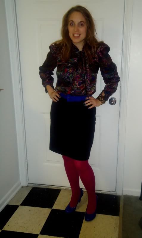 Shirt - Thrifted: $4.99Belt - Thrifted: $1.99Skirt - Thrifted: $6.00Tights - Thrifted (unpackaged from Target): $3.00Shoes - Forever 21: $15.99
If you can't properly see the colors on the shirt, maybe this shot will serve you better...
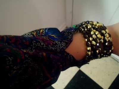
Also my lovely necklace, which has been re-purposed as a cuff for this post. (Only $6.00 at Forever 21!)
If you're still having trouble seeing the colors, they include a canary yellow, fuchsia, a deep red, kelly green, royal blue, white, and purple against a black background. It's best described as all blending together in a semblance of a paisley pattern. If you know my personal sense of style, you will understand why this shirt screamed at me from the Goodwill stacks. It's colorful, it's elegant, it's just me. That is one of they key elements I would ALWAYS use to describe my own personal sense of style: colorful.
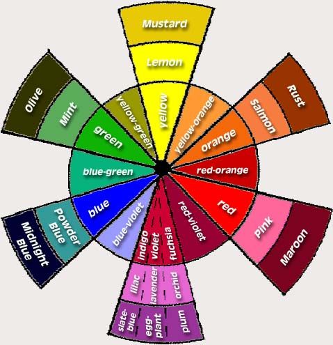
What does it mean to be colorful? I would say it definitely involves being color oriented. What is color oriented? Well, if you wish to be color oriented, you must first be best friends with the amazing color wheel:
 (Source)
Admittedly, this is a very intimidating looking color wheel, but it is the best color wheel I could find for the best use in my own example for this blog. We'll take it slow. Let's find our shirt colors in the wheel. For purposes of using this specific color wheel, let's say the colors that we have are fuchsia, lemon, green, blue, plum, red-orange, and white. I would also say that my tights, belt, and shoes that I am wearing with this outfit are fuchsia and blue. Now for steps on undertaking an outfit such as this...
1) Always match complimentary colors with your focal piece.
For this outfit, the focal piece is clearly my shirt. A neutral skirt is a safe bet to pair with the shirt. Yes, the undertone of the shirt is also black, but the various colors on the shirt make it stand out as a "busier" piece than usual. A neutral is always good for tying an outfit together. To bring the color back into the outfit, I've chosen tights in a color that are also in our shirt and shoes and a belt that also match a color from the shirt. It doesn't look too busy because the color has been broken up with the skirt. The black skirt also does not wash out the color since we've chosen two tones from the skirt and played them up with subtle accents. It all ties together!
2) Pick whatever accent color speaks to you.
I tend to favor "cool" colors (greens, blues, purples) over "warm" ones (reds, oranges, yellows). This is why I've chosen to go with the blue belt and shoes and the fuchsia tights. You've got seven accent colors in all that one can easily spot in the shirt. Pick whichever color you favor and go with it...just make sure at the end of the day the shoes match! ;)
3) Neutral and simple accessories are best.
Because this is a high-necked vintage top with a tie around the neckline, I would not need to wear a necklace. You can't see it in the above picture, but I'm wearing the simple pearl and gold post earrings I was wearing in the "Let it Snow" post. I also have my re-purposed necklace/cuff. That is it. Too many accessories is going to make this already busy outfit outrageously busy and over the top. I've got an elegant, neutral gold working in my accessories. It's just enough to make the piece pop without overwhelming the general public.
Continue your color education in Part Two! (Coming soon...)


No comments:
Post a Comment