Showing posts with label color matching. Show all posts

Wednesday, February 13, 2013

It's Still Winter...
No Need to Be S.A.D.

Wear a bright outfit even if the snow is piling up outside your windows...


 photo DSC04277_zps0eaa8b30.jpg


My outfit:  Sweater ($10): Gap // Tee (Gift): Old Navy // Skirt ($6): Forever 21 //  Tights ($5): Target
Shoes ($15): Forever 21 // Bracelet Set ($4): Forever 21
Sunglasses ($6): Thrift Store // Necklace: (Heirloom)

Wear the colors! (Left to right):  stockorange-ish thingback to the fuchsia124115Tree Trunk
Find them via my profile @ Colourlovers


Take advantage of the (not really) post-Winter/pre-Spring sales!  Stores are getting shipments of all of their Early Spring 2013 merchandise, so they've got to make way by marking down the old product.  Why not try this crazy ASOS scarf or (super trendy) emerald anorak to tide you over until those first peeks of grass?


 photo coatcollage_zpsd66a3398.jpg

Try some layering tricks like the ol' tights + socks + boots combo!  It really spices up your outfit and gives your look a "pop" even during these icky months.


On left:  SocksBootsTights
On right:  BootsSocksTights


What about the guys?  There are no lack of sales for them, either.  Check out this set complete with a fresh off the sale rack Hooded Mac jacket courtesy of the Gap.


I hope some of these sales brighten up your snowy February!  I'll be traveling to L.A. in the coming days, so updates may be scarce.  Hopefully, I'll be updating from sunny California with more cute outfits!  Check back soon, readers.

Until next time,

~ they seek her there

Friday, June 8, 2012

Trend Tip: "Hot" Colors

Summer is upon us! (At least it definitely feels like it where I'm from...) This means a shifting of the minds (and wardrobes). Lighter fabrics - in weight and color - and a re-thinking of how you're going to stand out when you step outside on those hot days.
With me, everything seems to come back to colors. It's always going to be colors. If you can pull off just the right color scheme, the rest of the outfit falls into place.

Yes, I'm going on and on about colors. So, what are some good color combinations for the upcoming season of pool side lounging and long days? I have an answer for you. Today I bring you three color trifectas which are sure to challenge you and give you a foolproof Summer look.

Photobucket


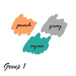
This is our first group - peach, gray, and aqua. This Spring has been all about "soft" and "delicate" looking shades. These include peach, gray, lavender, and mint. I guarantee that each of these shades will show up in this post. However, you can't just have a look for Summer that is made up of only soft colors. We're no longer transitioning from the cold months to rainy days and balmy nights. We're now in the months of heat waves and neverending sunshine. There needs to be a bit more of a "pop" to the color coordination we're trying to pull off. That's where the aqua comes in. This is how I've styled this group:


Photobucket

Scarf - $2 (Thrifted)
Earrings - $1 (Thrifted)
Sweater - Gift (Old Navy)
Dress - $20 (H&M)
Shoes - $6 (Target)
Sunglasses - $15 (Target)


I'll tell you a bit of a secret about this look - I took these pictures in early Spring. Even then I was thinking ahead and trying to add something to the normal color combinations that were suggested for the season. Against the pale and delicate palette of peach and gray, the aqua earrings really pop! Feel free to style in a more demonstrative way when you try this out for yourself.


Photobucket

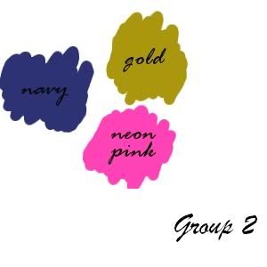
Neon is everywhere for Summer. If you've been a regular reader of this blog, you will be already well acquainted with this fact. If you've been reading, you'll also know that one cannot dress in neon alone. It must be balanced out with various neutrals. Navy and gold definitely qualify as such.

Photobucket

Earrings - $3.80 (Forever 21)
Shirt - $15 (H&M)
Cami - $8 (Kohls)
Necklace - $7 (Forever 21)
Skirt - $3 (Thrifted)
Shoes - $6 (Target)

I will admit that this shirt doesn't truly have neon pink detailing, but it's a vibrant pink nonetheless. I also broke a very important (and personal) fashion rule - wearing loose fitting clothing all around. Usually a belt would be required with two pieces such as these, but I've been seeing the "bohemian" nature of this outfit on various blogs lately and decided to give it a go. I wasn't disappointed. It also taught me a nice little fashion lesson - rules can be bent and/or broken. There is a time and a place for certain fashion choices, but when something is as casual as this look, the rules can be re-evaluated.


Now it's your turn...


Photobucket

Got a look that you've been able to pull off for Summer using this color scheme? Are you thinking of trying this color scheme out? Feel free to leave comments/your own examples of this "try your own" trio.

Until next time!

~ they seek her there

Monday, January 16, 2012

Our friend, the Color Wheel - Part 2

About a month ago, I addressed how to dress in complimentary colors in my first color wheel post. If you missed that post, I encourage you to click here and read that article first! For those of you who have already read the first post, your very long wait is over. Welcome to part two!

We'll start off (as usual) with the example outfit...


Photobucket

Shirt - JCPenney ($14.99)
Scarf - Old Navy (Gift)
Belt - Ebay ($8.00)
Skirt - Wet Seal ($5.00)
Tights - Forever 21 ($4.00)
Shoes - Forever 21 ($15.00)

As you might guess, the skirt is the focal point of the colors in this look. My shirt, scarf, and tights are some of the colors in the skirt that stood out to me upon first glance. Take a look at the pattern and see what colors jump out to you.


Photobucket

As you can see, there are many to choose from; so many that it's hard to pick just a few. I could have done sky blue, cobalt, mint green, pale yellow, light brown, even a near olive shade! The fact that I picked a vibrant red, purple, and mustard yellow to take from this skirt is just a testament to how much I adore bright colors and the fact that this was the last rare 50 degree day in Chicago (at least for a few months)! It's up to you, your personality, and the season that you wear this pattern in which will determine the colors you choose to highlight. This brings me to the next bullet point on the list.

4) Seasons determine the colors that you sport.

Point number two (Pick whatever accent color speaks to you) also goes hand in hand with your surroundings. Yes, it's January in Chicago, but up until a few days ago, we were experiencing Spring-like weather. In my opinion, this skirt transcends the seasonal color suggestion. That may not be the truth for some of you out there. Fashion commonly dictates that certain color options accompany the change of the seasons. Usually, these are common sense changes - bright colors for Spring and Summer; browns, yellows, oranges, dark reds for Fall; and paler, more washed out colors for Winter. In between the seasons, colors that are trending may slowly transition. It's up to you to determine if you want to follow the seasonal color suggestions exactly, or if you want to throw in a little bit of your own interpretation as I've done here. Feel free to experiment. It's always up to you.

5) Patterns are the friendliest complimentary color palette.

If you look back at the last Color Wheel post and examine my focal point for this outfit, you will notice a glaring similarity - both of my "main" pieces sport colorful patterns. If you are going for complimentary colors (especially in accessorizing), it is easiest to work with multicolored patterned clothing. For me, I like going a bit outside the box with my accessories (i.e. not perfectly matching the colors), but for this outfit, I've put together some accessories that draw out those colors that really caught my eye in order to give you a "jumping off point" of sorts.

Photobucket

Necklace - Forever 21 ($3.80)
Bracelets - Forever 21 ($6.80)
Earrings - Thrifted ($1.99)

We discussed in the last color post about gold being a neutral. I've also decided to highlight the greens, blues, and reds in the skirt with the set of bracelets and earrings. These, too, have gold accents to tie them back in with the necklace.

Once you are more comfortable with picking out colors from your focal point in the outfit, you can start picking more avant garde looking accessories.

6) Have fun, and don't be afraid to take the next step!

Learning how to match and compliment colors does not happen overnight. It takes practice and many outfits. Don't ever be afraid to think outside the box when you have reached your comfort zone. That is how fashion is made!

Have any of my steps helped you out in your daily dressing excursions? Do you have tips for drawing out complimentary colors? Comment on this post to tell me all about it!

Until next time.

~ they seek her there

Monday, December 12, 2011

Our friend, the Color Wheel - Part 1

Remember a few posts ago when I promised to teach you the fine art of color matching? Well, this is part one of that post. You're in for a lot of logistics, so sit comfortably and read on! Hopefully, when you are done with this post, you will have a bit of a renewed (or new) idea on the concept of complimentary colors.

First, my outfit example for this post:


Photobucket
Shirt - Thrifted: $4.99
Belt - Thrifted: $1.99
Skirt - Thrifted: $6.00
Tights - Thrifted (unpackaged from Target): $3.00
Shoes - Forever 21: $15.99

If you can't properly see the colors on the shirt, maybe this shot will serve you better...


Photobucket

Also my lovely necklace, which has been re-purposed as a cuff for this post. (Only $6.00 at Forever 21!)

If you're still having trouble seeing the colors, they include a canary yellow, fuchsia, a deep red, kelly green, royal blue, white, and purple against a black background. It's best described as all blending together in a semblance of a paisley pattern. If you know my personal sense of style, you will understand why this shirt screamed at me from the Goodwill stacks. It's colorful, it's elegant, it's just me. That is one of they key elements I would ALWAYS use to describe my own personal sense of style: colorful.

What does it mean to be colorful? I would say it definitely involves being color oriented. What is color oriented? Well, if you wish to be color oriented, you must first be best friends with the amazing color wheel:

Source: http://aggie-horticulture.tamu.edu/floriculture/container-garden/lesson/colorwheel.jpg
(Source)


Admittedly, this is a very intimidating looking color wheel, but it is the best color wheel I could find for the best use in my own example for this blog. We'll take it slow. Let's find our shirt colors in the wheel. For purposes of using this specific color wheel, let's say the colors that we have are fuchsia, lemon, green, blue, plum, red-orange, and white. I would also say that my tights, belt, and shoes that I am wearing with this outfit are fuchsia and blue. Now for steps on undertaking an outfit such as this...

1) Always match complimentary colors with your focal piece.

For this outfit, the focal piece is clearly my shirt. A neutral skirt is a safe bet to pair with the shirt. Yes, the undertone of the shirt is also black, but the various colors on the shirt make it stand out as a "busier" piece than usual. A neutral is always good for tying an outfit together. To bring the color back into the outfit, I've chosen tights in a color that are also in our shirt and shoes and a belt that also match a color from the shirt. It doesn't look too busy because the color has been broken up with the skirt. The black skirt also does not wash out the color since we've chosen two tones from the skirt and played them up with subtle accents. It all ties together!

2) Pick whatever accent color speaks to you.

I tend to favor "cool" colors (greens, blues, purples) over "warm" ones (reds, oranges, yellows). This is why I've chosen to go with the blue belt and shoes and the fuchsia tights. You've got seven accent colors in all that one can easily spot in the shirt. Pick whichever color you favor and go with it...just make sure at the end of the day the shoes match! ;)

3) Neutral and simple accessories are best.

Because this is a high-necked vintage top with a tie around the neckline, I would not need to wear a necklace. You can't see it in the above picture, but I'm wearing the simple pearl and gold post earrings I was wearing in the "Let it Snow" post. I also have my re-purposed necklace/cuff. That is it. Too many accessories is going to make this already busy outfit outrageously busy and over the top. I've got an elegant, neutral gold working in my accessories. It's just enough to make the piece pop without overwhelming the general public.

Continue your color education in Part Two! (Coming soon...)