Saturday, March 24, 2012

So you want to dress like...Fierce women of T.V.

I don't know about the rest of you, but I would kill for some of the pieces certain women on T.V. wear. I've been known to watch a little bit too much television, and from this results in drooling over the wardrobes of characters in my favorite shows. This post details four amazing styles that are modeled by four awesome women of T.V. Don't forget to leave your own inspirations for dressing in the comments if you feel like sharing!


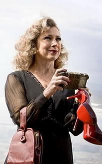
1) River Song
Photobucket


As seen on: Doctor Who
Portrayed by: Alex Kingston

Style profile: River Song dresses elegantly but functionally. She's hard and feminine all at the same time and never compromises her taste for expensive things. See the shoes she's holding in that picture above? Those are Christian Louboutain's! It's no secret that River Song knows who she is and how to convey that in her sense of fashion.

My interpretation: Bold colors, clean lines, hardware, and "playful" accessories are essential for pulling off a look like River's.


River Song concept outfit


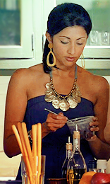
2) Divya Katdare

Photobucket


As seen on: Royal Pains
Portrayed by: Reshma Shetty

Style profile: Divya lives in the always sunny and bright Hamptons, and her wardrobe never fails to reflect this. Pastels and neutrals highlight her beautiful skin tone and add an accent to the beachy background of the show. Her clothes are also functional as she has to be constantly on call for the HankMed business.

My interpretation: Pastels, simple pieces, and contrasting accents in the accessories.


Inspired by...Divya Katdare


3) Helen Magnus

Photobucket


As seen on: Sanctuary
Portrayed by: Amanda Tapping

Style profile: Helen Magnus is one of the more ambitious and tough female characters on T.V. right now. She balances dealing with world governments, running her own tactical team, and balancing her 150 year or so love life. Talk about a woman of many talents! She's a woman who demands to be taken seriously just at the sight of her, but one who never fails to be wearing a great pair of shoes at the same time...

My interpretation: Neutrals, metallic accessories, and a "popping" shoe convey an "in charge" and feminine silhouette.


Helen Magnus inspired set


4) Leslie Knope

Photobucket


As seen on: Parks and Recreation
Portrayed by: Amy Poehler

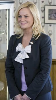
Style profile: Leslie Knope is first and foremost her own person. She cares little about what people think of her and focuses only on her work and even more on her friends. She is never lacking in dedication. Leslie's manic and feminine, and her clothes always reflect this. She works for the city government, so she must be put together. Personality is added with fun colors and even better prints.

My interpretation: Fun prints dressed up with a blazer and neutral accents for the office. The bow belt and bow-accented shoe add a bit of femininity to the entire ensemble.



Inspiration...Leslie Knope

Wednesday, March 21, 2012

Trend Tip: Colored Jeans - To dress up or down?

Photobucket
This season, I'm finding it harder and harder to ignore the colored jeans trend. Not that it's a trend that I don't enjoy! In fact, I own five pairs myself. (If you're surprised, you probably haven't been reading this blog for all that long...) I've just found myself contemplating this trend more frequently as of late. Colored jeans have been around for several seasons. What exactly is making me focus on them right now?

I know some people struggle with the concept of taking advantage of this trend, but that's not my primary problem. I find myself judging the colors of said jeans in an attempt to categorize them as "fun" or "business casual". What a weird thing to think about, right?

Questions such as these are becoming more common the longer I write in this blog. I try to maintain a fine balance between dressing for work and what I consider "casual". Even my definition of "casual" isn't a simple t-shirt and jeans look. I'm always looking for a way to "dress it up". When I'm at work, I like to project a professional air. When I have the day off, it's the opposite. I prefer to show my "fun" side and exercise my talent for color. This is where the colored jeans question comes in. Are there certain shades of colored jeans that might look better when trying to dress business casual vs. everyday casual.

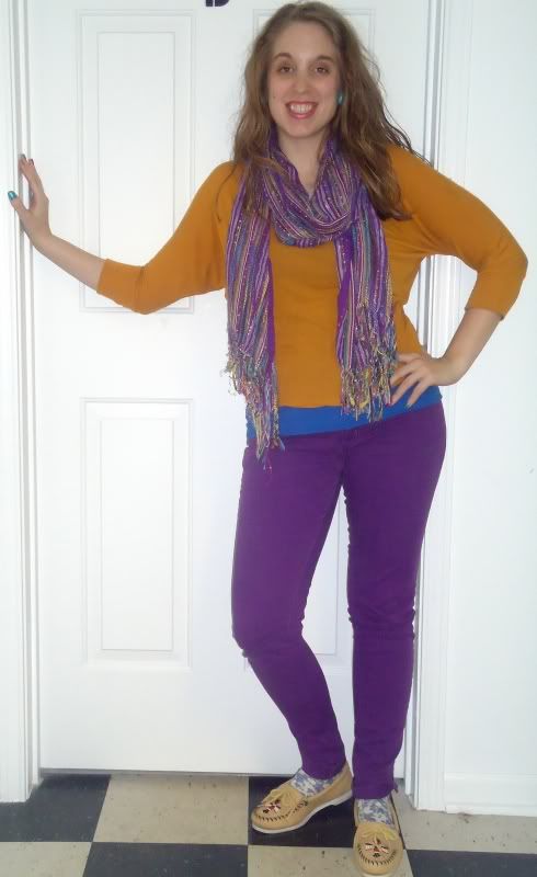
I've found that purple jeans might just be part of a "fun" outfit rather than a serious one...


Photobucket
Scarf - $10 (Forever 21)
Top - $13 (Forever 21)
Cami - $7 (Kohls)
Jeans - $15 (Rue 21)
Socks - $.97 (Gap)
Moccasins - $8 (Thrifted)

Yes, this look is pretty loud. It's one of my more loud ensembles to be sure. The best thing is, I just sort of threw this on and it worked out. Sometimes you get lucky like that in fashion.

My point really is, I believe it would be hard to appropriately dress this look down. Even if you decided to pair these jeans with the rest of the outfit being neutral pieces, they would still pop - unavoidably!

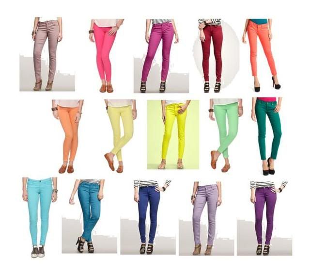
So what would I deem to be "business casual" colors? Here are some of my picks...

1) Red
Gap

This is a more toned down shade that sets you apart from the next person in your office, but it doesn't go overboard. When paired with neutrals, it blends rather than stands out glaringly. This color is classy and unique.

2) Dark Green

I feel much the same way about this shade as I do about the red shade I've chosen above. It's a jewel toned shade, so any neutrals you pair it with will look amazing. It also doesn't look too out of place with said neutrals. This is going to set you apart from the next but not get weird looks thrown your way.

3) Mint

I think this color successfully treads the line between "fun" and "office appropriate". I also couldn't get away with doing a Spring trend post and not have a pastel in the chosen mix! These mint colored jeans can be pared with tasteful yellows, nudes, and browns. Again, toning down the rest of the outfit is the key for you to pull off such an "in your face" color!

4) Blue
Gap

I can't decide if I'm cheating with this color. On one hand, these pants are a little bit more "blue" than normal jeans, but they still have the neutral properties a pair would convey. In my opinion, these are also a nice jewel toned shade which could be paired with a plethora of neutrals.


Now that I've done the more serious colors, it's only fair to give you my "fun" picks as well...

1) Pink
GAP jeans

This is a playful shade that transcends all seasons. Personally, I wear my pink jeans Spring, Fall, and Winter. They never get old. This shade is toned down enough to get away with even in the cold months.

2) Coral


Charlotte Russe jeans

Coral is a personal favorite color of mine. So, I might be a little biased with this look. Coral is an amazing color for Spring, and it can only really be worn in the "warm" months. Take advantage of this shade while you can!

3) Lavender
GAP jeans

This is a quintessential Spring shade that is easy to dress! Wear it with other pastels or neutrals. This shade is very "anything goes".

4) Aquamarine
GAP jeans

This is another shade that I think would be appropriate for three out of four seasons. I'm finding the strange impulse to go out and find jeans of this color because it just really goes with so much! Even if you don't like too much color in your wardrobe, I think you could settle for trying this shade out.


Do you own a pair of colored jeans or are you still afraid to try this trend? Feel free to comment here about your experiences or if you desire advice on rocking this Spring look! I am happy to answer any questions.

Until next time!

~ they seek her there

Friday, March 9, 2012

Trend Tip: Color Crush

I can't walk through a single clothing store right now and not find gratuitously shaded tees, jeans, skirts, and tights hanging on the racks. It's Spring once again, and it's time to break out the brightly colored ensembles!

It's no secret that I love color, and I love re-evaluating my look for a new season. I also love buying new items that add a bit of those specific seasonal trends without putting a dent in my paycheck.

Every so often, I'll see a piece that pops out at me from the blog or magazine I happen to be perusing. Then, I look at the price attached to said piece. Most of the time, I have to steel myself for the reveal. I nearly always anticipate that what I've seen is going to be incredibly outside my normal price range.

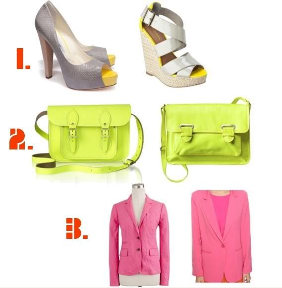
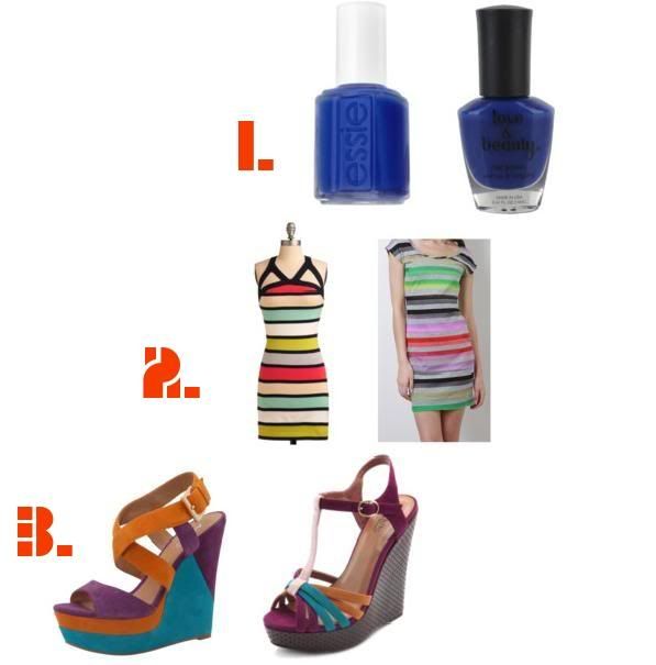
Tired of being shocked and dissatisfied, I took up a challenge: find pricey items I like and assign affordable (and equally adorable) alternatives for them! Below are my two sets of picks. The expensive items are on the left and their alternatives are on the right.


Photobucket


Photobucket


These pieces don't hold back and are not ashamed to be bold. That's what this Spring is all about - being bold and bright! Don't be afraid to show off your more fun side this coming season. After the drab winter, I'm excited to get out there and rock this trend. I can only hope to get you guys equally excited by it!

Have you spotted something you'd like to see an affordable alternative for? Post in the comments or shoot me an e-mail, and I will feature it here!

Until next time!

~ they seek her there

Wednesday, March 7, 2012

Musings on Inspiration

Last week I came to the realization that I've hit a dry spell of sorts. I had every desire to provide you, my readers, with the best fashion advice and creative ideas I can offer. I tried and tried and tried. I couldn't count how many times I sat down at my computer and nothing was flowing. It wasn't until a few days ago until I really pinpointed the source of my un-inspiration. Now that I had identified the problem, I had to determine what to do about it.

I didn't have to mull over that question for very long. A friend sent me this video. Yes, that is John Cleese of Monty Python fame speaking very seriously about creativity; more specifically the necessity of "play time". So, I took some "play time" to think about the sort of thing that inspires me. This is what I came up with...


Photobucket

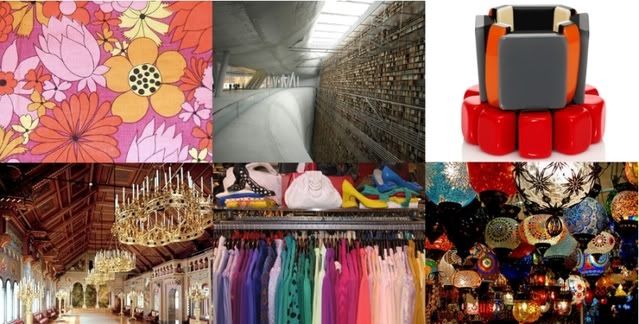
(From top left: vintage floral print, Stockholm Library, colorblock goodness via H&M, Neuschwanstein Castle, thrift store love, lanterns in Turkey)

Everyone's creativity is stimulated in various ways. Surprisingly, this little photoset isn't dominated by conventional, "fashionable" images. I go for colors over couture any day. Color is what draws me in, inspires me, and gets me in an excitable mood. Far-off places is the other underlying theme in this mini-collage. A single concept that never fails to generate fanciful thoughts and dreams in my mind are the picturesque locations one can only hope to someday visit. There is such history, beauty, and a story in each of these places. I aspire to someday design a line around my personal "Wonders of the World" locales.

Now that I've told you a little about my creative process to get my "inspiration juices" flowing, I want to know what gets you excited about expressing yourself!

Feel free to comment below and share with the rest of the class what makes your creative process so fantastic.

Until next time!

~ they seek her there